
- 0
- 920 words
Picture the same café name on two signs. One uses a thin, formal serif. The other uses loose, hand-drawn lettering. Before you see a menu, you are probably imagining two different places.
Typography contributes to that expectation. It gives words a visual tone, much as pace and emphasis affect a spoken sentence. But there is no universal formula where one font automatically makes a business trustworthy or another guarantees a youthful audience.
The useful question is whether the type supports what your brand actually offers, and whether people can comfortably read it where it appears.
Start with the impression you want to earn
Write a short description of the business before opening a font library. “A neighborhood café with familiar food and a relaxed atmosphere” is more useful than “modern and premium,” because it describes an experience a customer might recognize.
Then identify where the words will appear. A menu, a small jar label, and a phone screen place different demands on the same letters. A beautiful headline can become frustrating when it is squeezed into opening hours or ingredient information.
Use real words in your early drafts. Long product names, prices, punctuation, and the languages your customers read will reveal problems that a short sample alphabet can hide.
Treat font categories as starting points
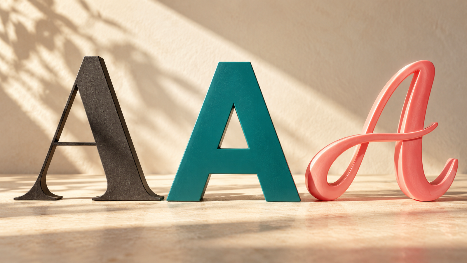
Serif typefaces have small finishing strokes. Sans serif typefaces omit those strokes. Script styles echo handwriting, while display faces are usually designed to attract attention at larger sizes.
Those descriptions help you compare shapes, but they do not decide the personality for you. A heavy serif can look bold and informal. A restrained sans serif can suit an elegant setting. The spacing, weight, color, wording, and surrounding design all affect the impression.
For the imaginary neighborhood café, try the same menu heading in several styles while keeping everything else unchanged. Ask which version feels consistent with the actual space and prices. You are judging a design in context, not assigning a permanent personality to an entire font category.
Decide what needs attention and what needs clarity
A brand does not need every line to perform like a logo. Give different kinds of text different jobs.
Your main heading can carry more character. Descriptions should be easy to read in a longer stretch. Prices, opening hours, and instructions should be easy to locate and distinguish. You may be able to do all of this with one versatile font family and a few weights.
Start with fewer choices than you think you need. Add another typeface only when you can explain the job it performs. Otherwise, the result can look like several unrelated businesses sharing one page.
Create a small sample with a heading, a short paragraph, a price, and an action such as “Book a table.” If each element is competing for attention, adjust the hierarchy before searching for more fonts.
Understand the difference between fonts and styled characters
Social profiles introduce another option that is easy to confuse with typography. Tools such as Fontalic create copy-and-paste text styles by using alternate characters. This can be useful for exploring a small decorative accent, but it is a different mechanism from selecting a licensed font for a website or printed label.
With an installed or web font, the same underlying letters are drawn in a chosen design. With many copy-and-paste styles, the characters themselves change. That can affect compatibility and how assistive technology handles the text.
Fontalic’s guide to copy-and-paste text explains that distinction and the limitations. Keep essential information in ordinary text. Use proper typography controls for your website and design files rather than trying to build an entire identity from decorative Unicode characters.
Test the awkward situations before the attractive ones
View your design at the smallest size people will encounter. Print a label at actual size. Open a page on a phone. Check a long product name and a number containing similar-looking characters.
Can you distinguish a capital I, a lowercase l, and the number 1 when it matters? Are the light strokes disappearing? Do accents and other required characters appear correctly? Does the heading wrap in a way that changes its meaning?
Ask someone unfamiliar with the layout to find a price or instruction. This is a practical usability check, not a scientific study of brand perception. It can still expose a problem before you repeat it across packaging and social graphics.
Check permission before making the choice permanent
A font being downloadable does not tell you whether every intended use is permitted. Check the actual license for commercial design, website embedding, apps, and any sharing of the font file with other people.
Adobe’s licensing guidance, for example, distinguishes between uses of finished artwork and situations requiring access to the font software or particular hosting arrangements. Do not assume another provider follows identical terms. Save the license information with the project and confirm what collaborators need.
This is easier to resolve while comparing options than after you have printed packaging or handed a website to a client.
Write a few rules your team can follow
Once you settle on the type, document which style belongs to headings, body text, and short labels. Include an example at a realistic size. Record the source of the font and the license details alongside the design files.
Your font choice helps set expectations, but consistency and readability determine how useful that choice becomes. Pick a style that fits the experience you deliver, test it with real content, and give the important words room to be understood.
Author

linguaezone.com@gmail.com
Related Posts
Nionenad.com: A Complete Guide to Its Website, Features, Content, and Online Presence
- 0
- 3,162 words
The internet offers countless websites where people can discover information, explore new ideas, and learn about technology and everyday topics. However, understanding...
Read out all
The Art of Handmade Knives: Materials, Design, and Traditional Craftsmanship
- 0
- 845 words
Handmade knives represent a meeting point between practical design and traditional craftsmanship. Although modern manufacturing can produce knives efficiently and consistently, handcrafted...
Read out all
How to Tell if a Goldfish Is Male or Female: A Complete Guide for Every Goldfish Tank Owner
- 0
- 1,899 word
The graceful movements, bright colors and unique personalities of the goldfish make them one of the world’s most adored aquarium pets. Regardless...
Read out all
Trallehylde: A Complete Guide to Stylish, Practical, and Space-Saving Shelving
- 0
- 2,891 words
Introduction to Trallehylde A well-organized home or workspace can make everyday life easier, more comfortable, and more enjoyable. Storage solutions play an...
Read out all
Jernsenger: Understanding Its Meaning, Uses, Features, and Growing Interest
- 0
- 2,615 words
The word jernsenger may look unfamiliar to many people, yet unusual terms often attract attention because of their distinctive spelling, possible cultural...
Read out all
MMSBRE: Understanding Its Meaning, Features, Uses, and Growing Online Interest
- 0
- 2,625 words
Introduction to MMSBRE The internet constantly introduces new terms, platforms, abbreviations, and digital concepts that attract people’s attention. One term that may...
Read out all